Brandt & Levie
Visual identity
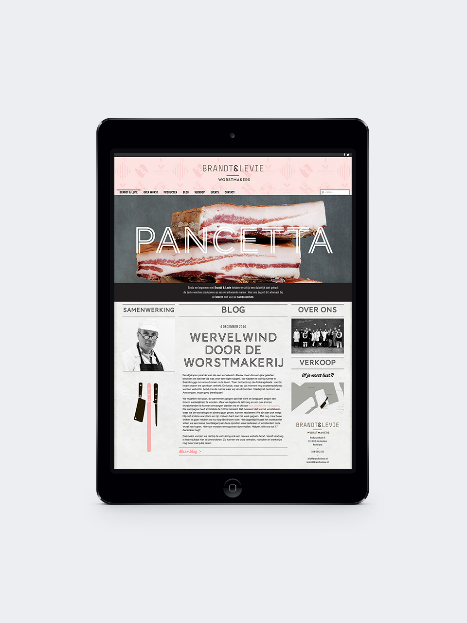
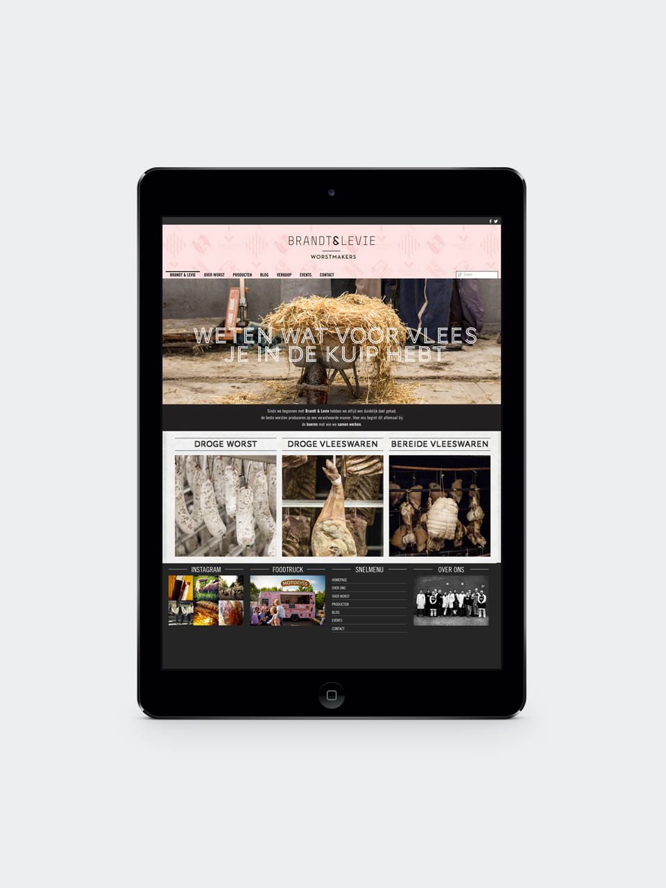
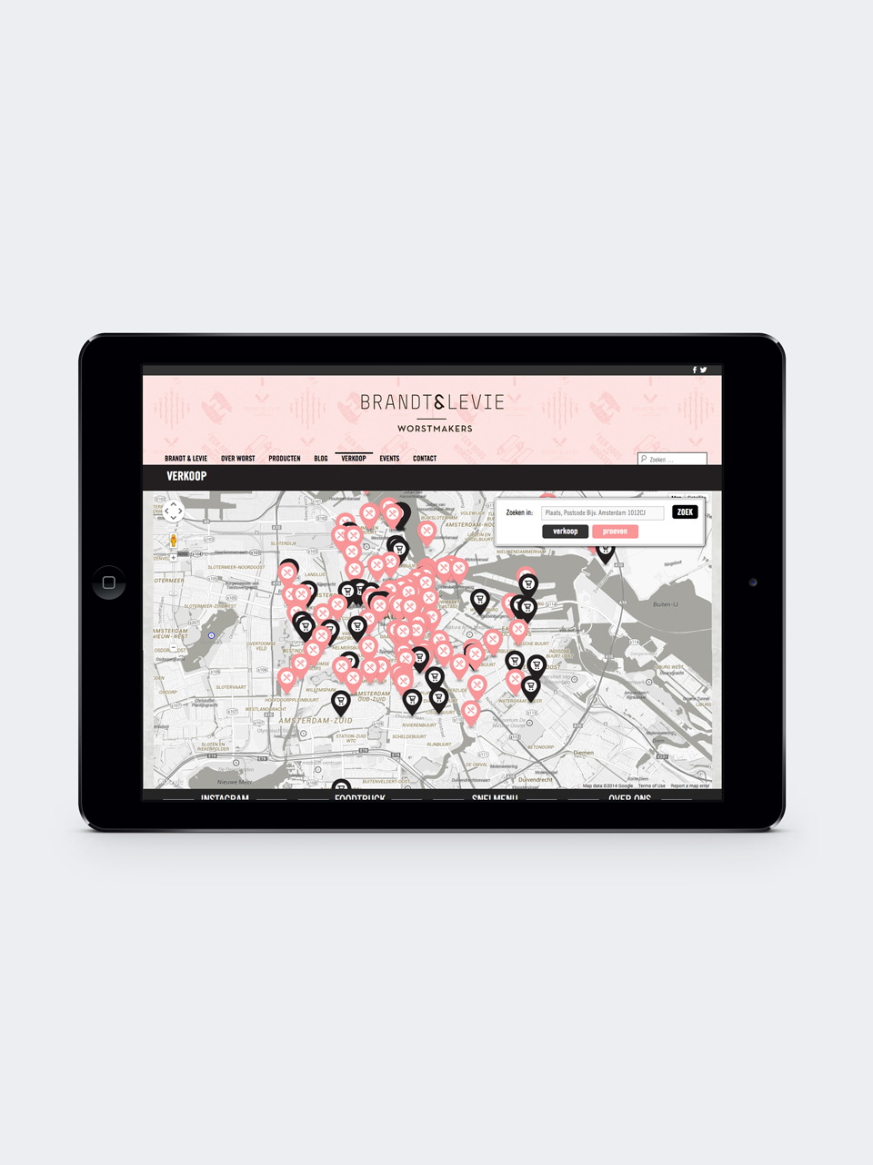
Brandt & Levie sausage makers asked Mattmo to create a distinct visual identity that would position them in a unique way within their market.
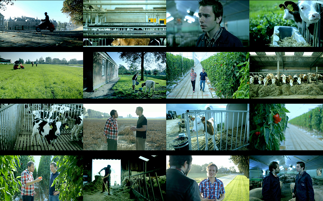
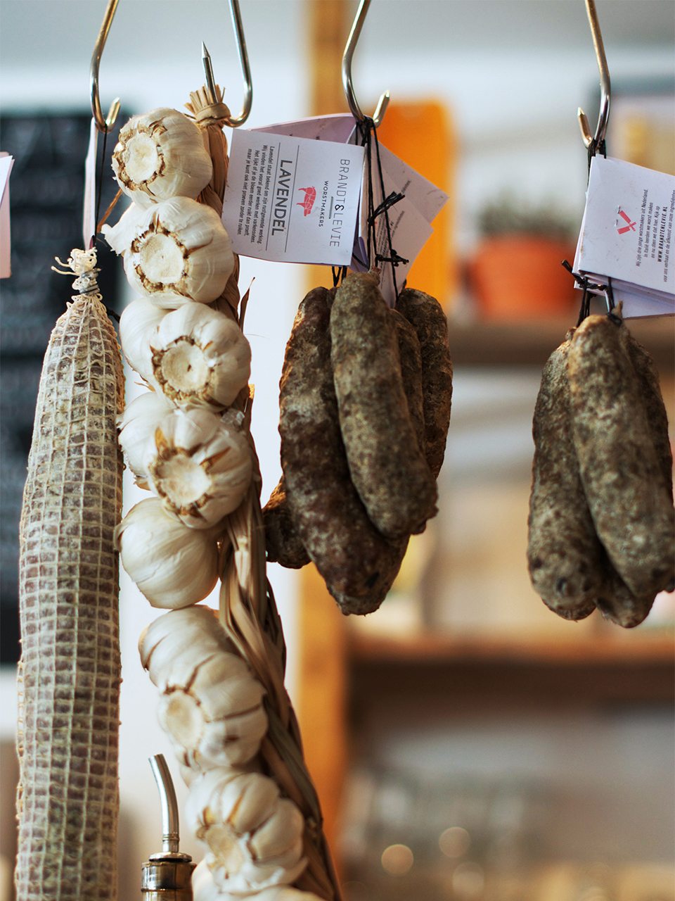
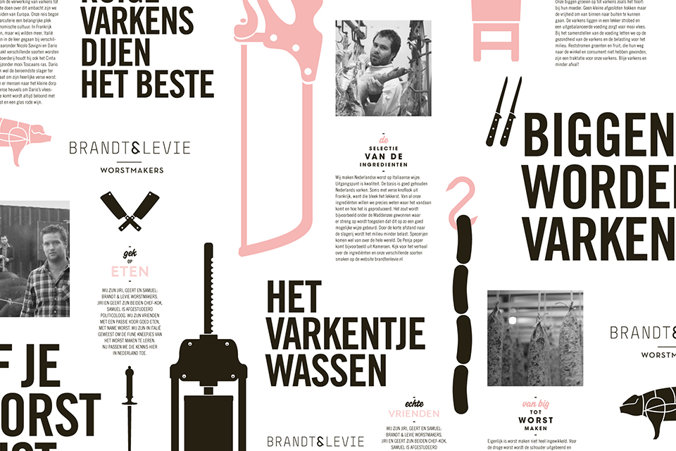
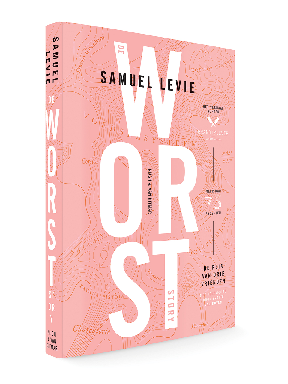
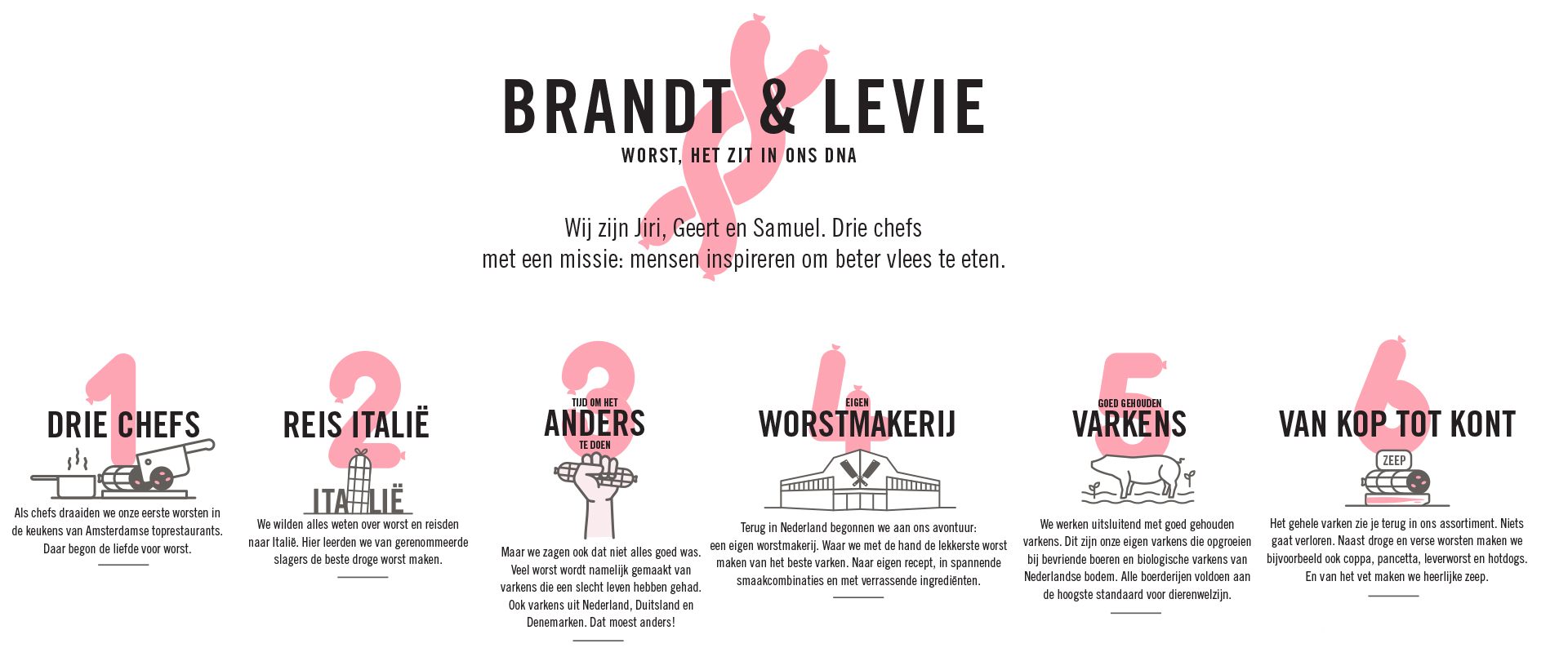
Jiri, Geert and Samuel are sausage makers. Samuel graduated from politics and Geert and Jiri are both chefs.
The three friends love food, especially sausages. They travelled to Italy learning how to make sausages the traditional and hand made way. Now they are experienced sausage makers in the Netherlands. Brandt & Levie asked Mattmo to create a distinct visual identity that would position them in a unique way within their market.
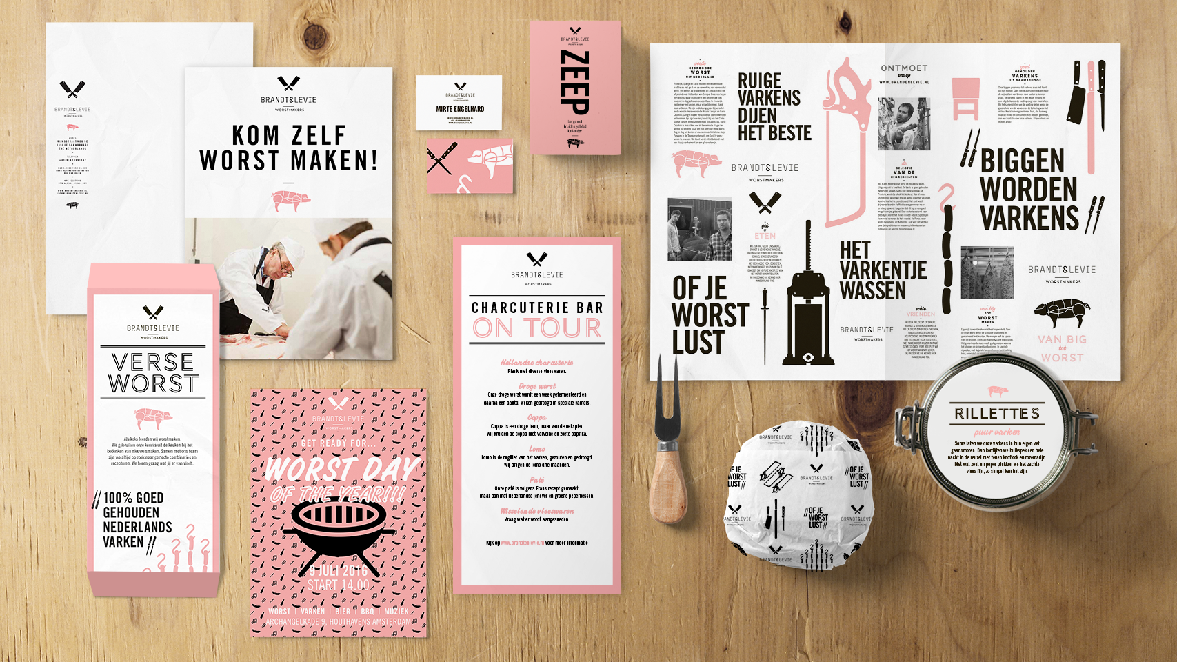
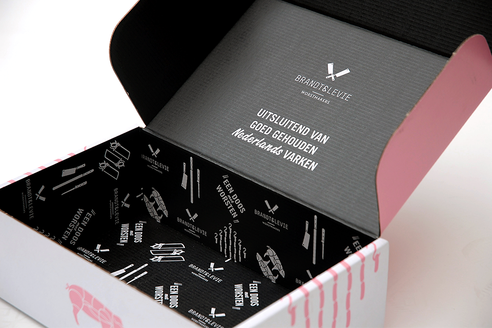
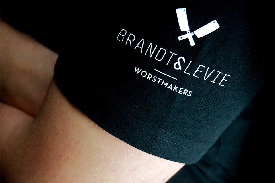
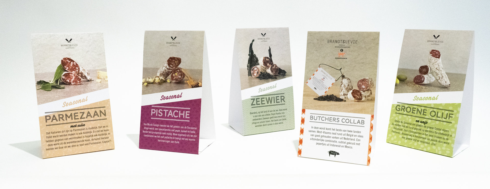
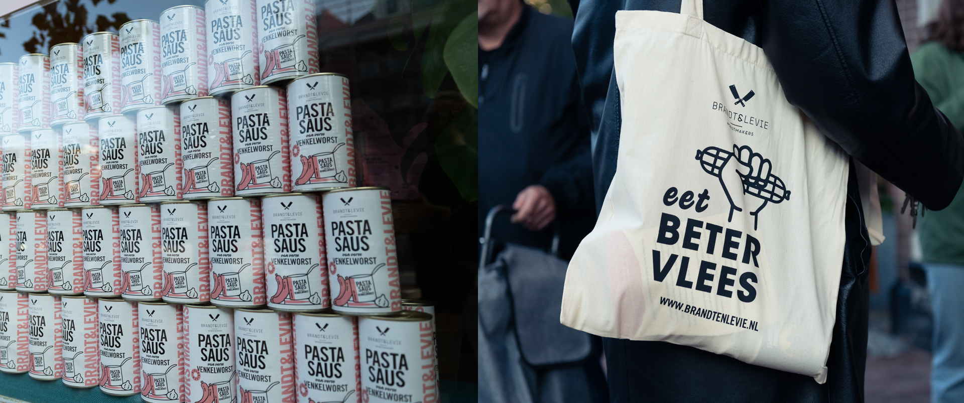
Mattmo chose to create a masculine and simplistic design.
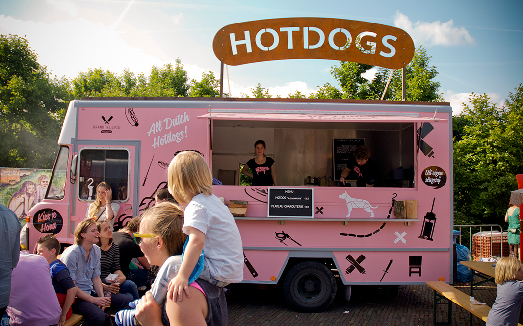
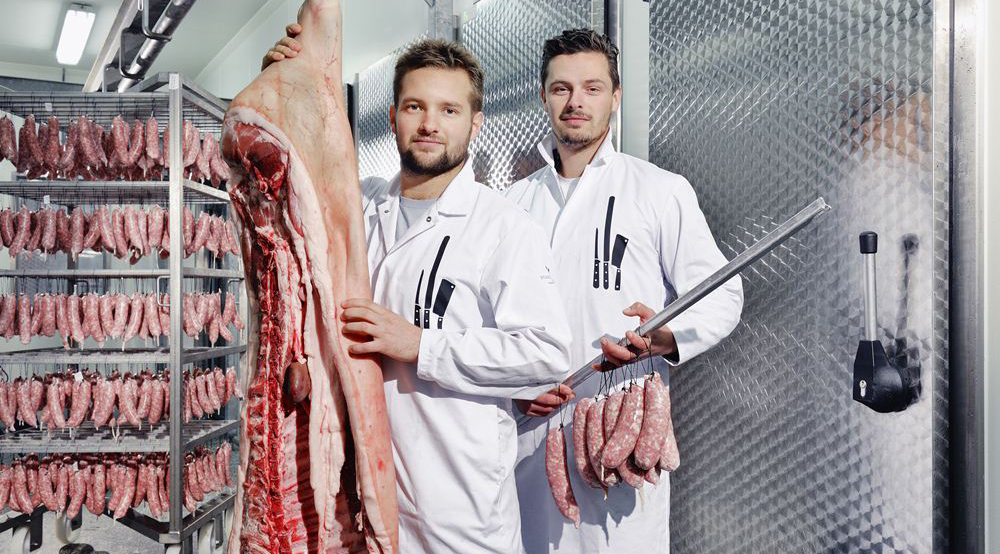
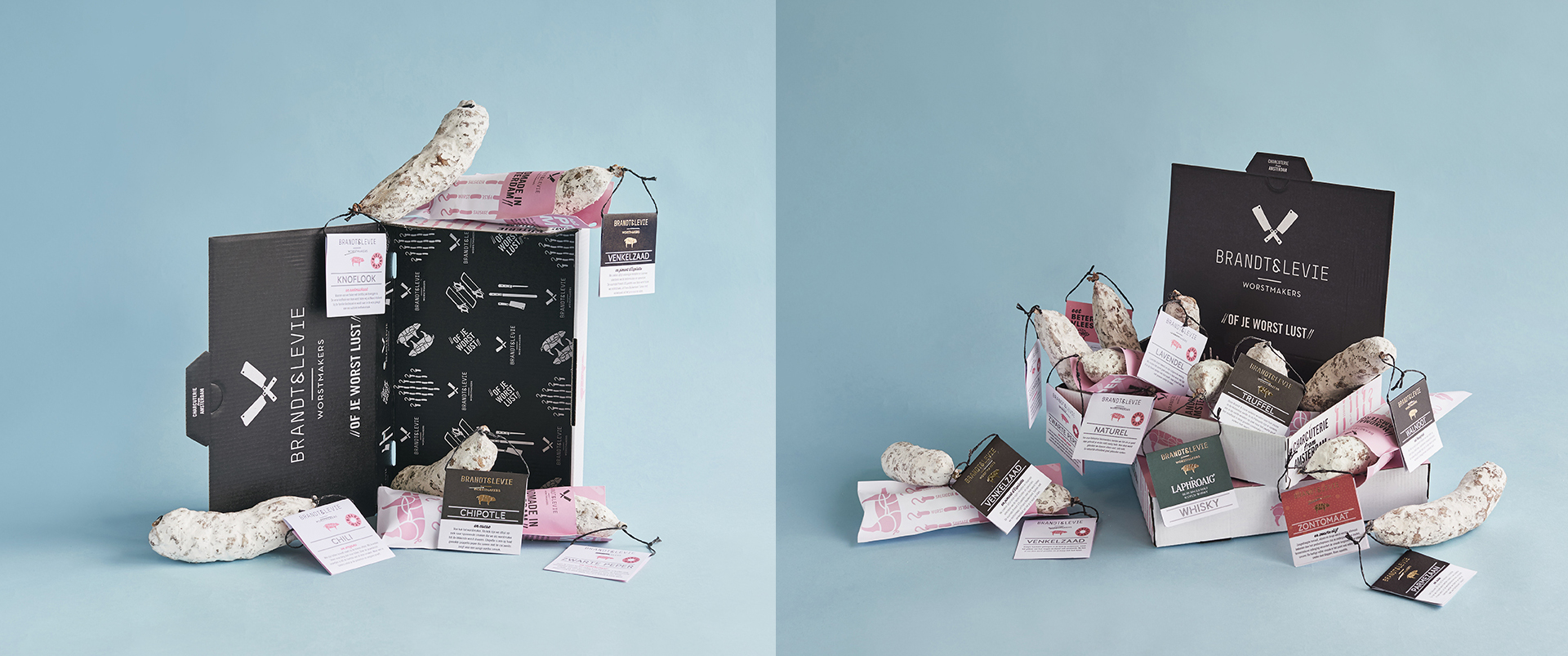
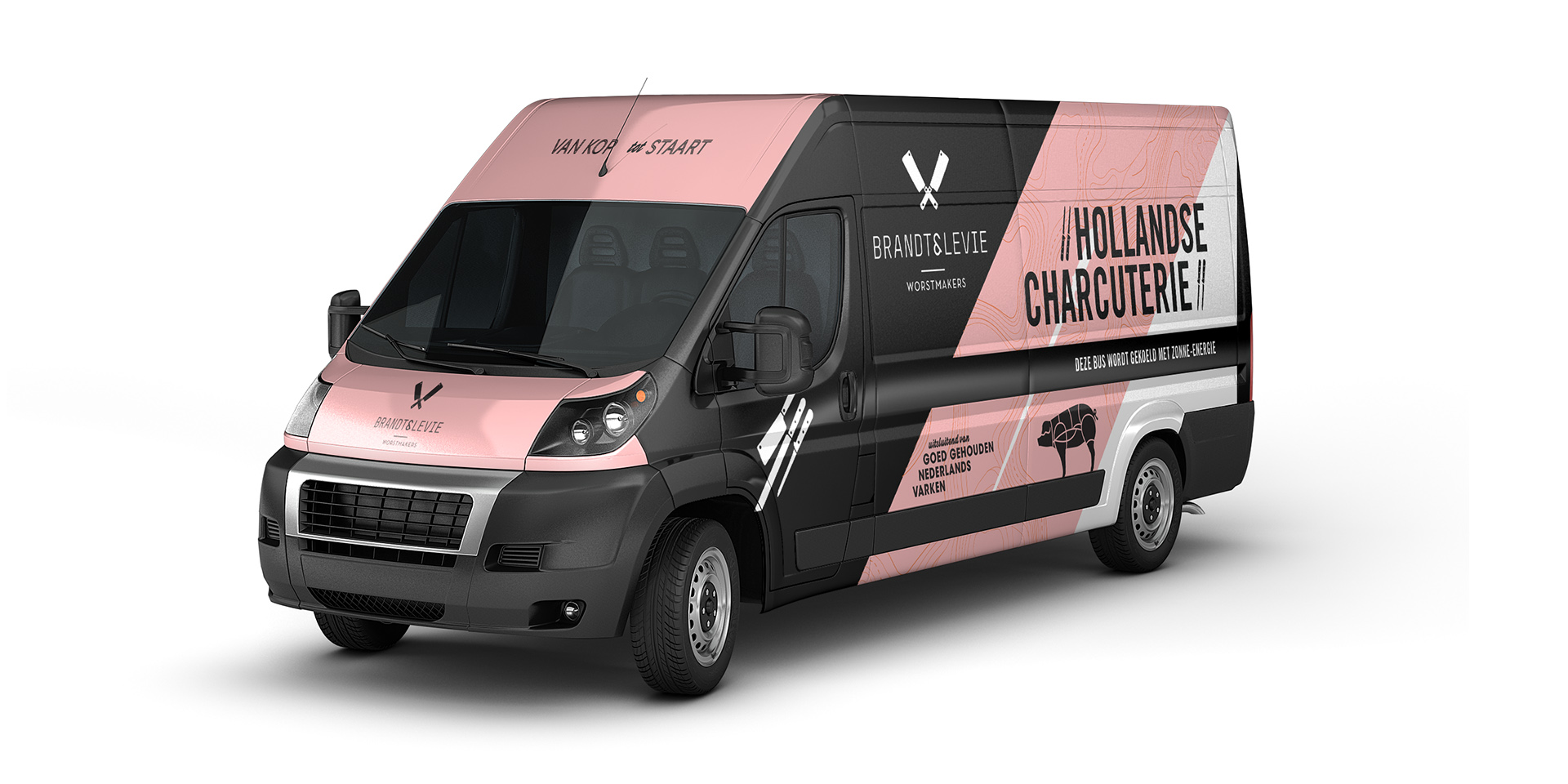
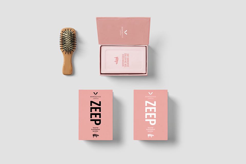
Instead of masking the macabre slaughter process, Brandt & Levie is one of the few sausage makers that claim that sausage comes from pigs. Their aim is to make the process of butchering more transparent. The visual identity of the company is simple and self-explanatory. Brandt & Levie’s color is a sausage pink and red.
The visual identity is an important representative of a company.
Mattmo investigated the core identity of Brandt & Levie and decided to make it their love of meat and hand made process the pillar. A modest, tough, masculine style was the result. Mattmo won the prestigious Red Dot design award for their identity design. See their website.
LET'S MEET
And talk about your product or brand